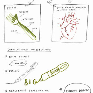
Talking Points: Exploring Line Weight in Drawing

Why is line weight important in drawing?
The way we make a line can completely change the feel of a drawing. Lines can be quick and energetic, soft and wispy, or bold and strong. By experimenting with the weight of a line, we can bring movement and expression to our drawings, create areas of interest and guide the viewers eye around a drawing.
Use the following images to explore the different ways line weight can be used in our work.
Please Note:
This page includes links and videos from external sites, verified at publication but subject to change.
Teachers should review all content for classroom suitability.
Report any issues, and check school firewall settings if videos don’t play.




Line weight refers to the thickness or thinness of a line. The weight of a line can be altered by applying different amounts of pressure to a drawing tool and by changing the drawing media.
Depth, tone, character and atmosphere can be achieved by exploring a variety of weighted lines in drawings.
When we look at the lines in drawings we may get an impression of what the artist was experiencing or what they are trying to communicate through their drawing. For example thinner lines can create a delicate peaceful atmosphere whereas thicker bold drawings can evoke a sense of power and authority.
Find a recording of a zoom session exploring line weight and how we can use it to improve drawing outcomes for teachers & learner.
Leo Gestel
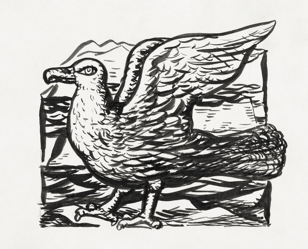
Seagull (ca. 1891-1941) drawing in high resolution by Leo Gestel. Original from The Rijksmuseum. Digitally enhanced by rawpixel.
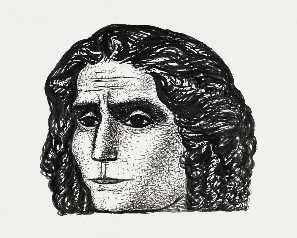
Portrait of Jean Jaurès (ca. 1891-1941) drawing in high resolution by Leo Gestel. Original from The Rijksmuseum. Digitally enhanced by rawpixel.
Taguchi Tomoki
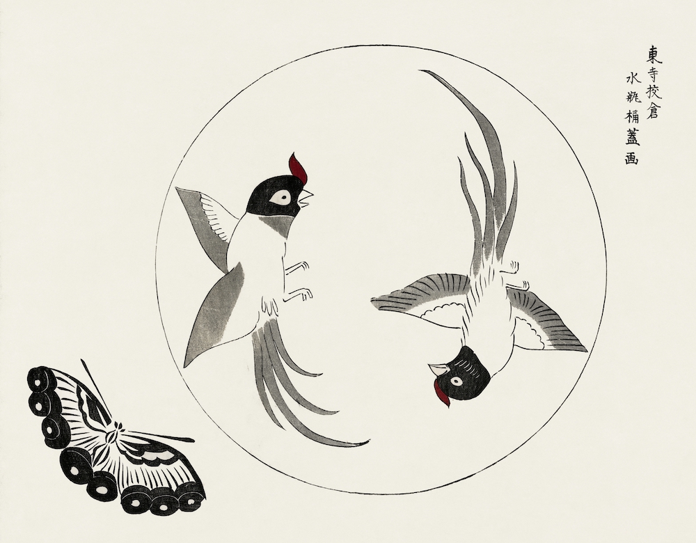
Japanese vintage original woodblock print of birds and butterfly from Yatsuo no tsubaki (1860-1869) by Taguchi Tomoki. Digitally enhanced from our own antique woodblock print.
Paul Signac
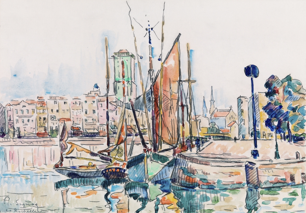
La Rochelle (1911) painting in high resolution by Paul Signac. Original from Barnes Foundation. Digitally enhanced by rawpixel.
Jean Bernard
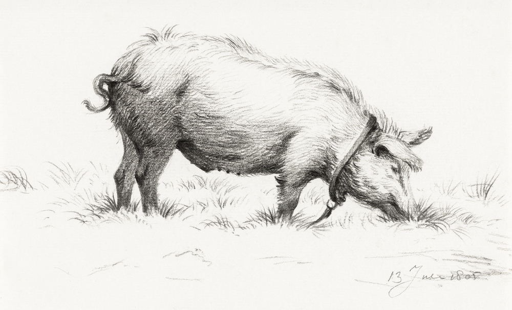
Standing pig in the grass (1805) by Jean Bernard (1775-1883). Original from The Rijksmuseum. Digitally enhanced by rawpixel.
Hermann Esser
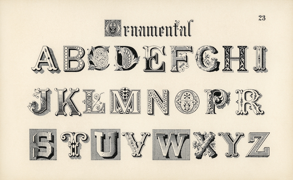
Ornamental fonts from Draughtsman’s Alphabets by Hermann Esser (1845-1908). Digitally enhanced from our own 5th edition of the publication.
This Talking Points Is Used In...
using sketchbooks to make visual notes
Show me what you see